Prior to entering GID01: History of Graphic Design, I had my presumptions of this class not being my cup of tea because it was a history class. However, I made the mistake of thinking this was just any history class that I had to endure "boring facts" when in reality I learned more in this class than majority of my other classes. The proof is in the pudding, and that vanilla, chocolate, tapioca, or whatever flavor pudding is desired, lies within the field journals in my blog.
In retrospect, the best way to describe what I learned in this class is the history of graphic design. Yes, that's the name of the class and it's very broad, but let me break it down with an analogy. As a dancer, break dancing to be specific, there are many moves in the dance, whether it's the flashy moves, intricate footwork, or the dancing before going down into the footwork. The only thing that makes breakdancing stand out is the footwork, the basic six-step and some variations; everything else originated from somewhere else: the flashy moves came from gymnastics, some steps outside of the six-step came from the Russian culture, some of the dancing (known as top rocks) came from traditional Cherokee dancing, salsa, jazz, house, disco, etc. Those who have a good understanding of the history utilize the foundation and create their own style. So what does this have to do with what I learned from this class? I learned that many of the originators for graphic design understood the history and incorporated their own style to what is still being used today: various san-serif fonts, television/company logos, book and magazine covers, page layout designs, maps, advertising based on cultural influences, printing pages and pictures, and the list goes on.
Having a good understanding of what designs came where, my awareness for looking at posters, covers, portraits, pictures, even words have risen ever since I took this class. I look at the books on my bookshelf and notice the different fonts their titles are in, trying to point out what font they are and where it came from (so far 2 for 25). I have a big painting hanging in my room that is expressionism-inspired, which I used to categorize as "just a painting." I've always heard of the Bible being the best-selling book, but I never understood why until I took this class, in addition of the many branches of Christianity being a result of the many copies of the Bible being widespread, having others interpret the Bible differently from the clergy.
Whether if others might think it's a waste of time, I've started to appreciate art, in general, more. Trying to guess the time period it was made, analyzing for cultural inspirations, how the colors were used, other designs being utilized, the type of font, it's like a new guessing game for me to pass the time when it permits.
To close off this blog, I've learned to appreciate history more: knowing what derived from what, where something originated from, how many people had the same idea, the progression of a movement, style or technique, etc. I have opened up a little more to do research on the origins of topics that I come across, mostly in my own interests, but as time passes I'll be open to look at the roots of other topics outside of my hobbies. In essence, I'm becoming more of a student than ever because I should be learning constantly, whether if it's something new or something that I already know, but deeper in its past.
I'd like to thank all of my classmates for sharing their blogs, as well as giving me their feedback on my blogs. Whether you agreed or disagreed, you've helped me see things in a different perspective than my own and I am grateful for that. I'd also like to thank Professor Manske for the lectures and literature, as well as helping my learning experience becoming more enjoyable and fun. Without you Professor, I would not have been able to take this class and learn what I know now, so thank you. I wish everyone good luck on their finals and happy holidays to you and your loved ones.
- Allen Matsumoto
Thursday, December 5, 2013
Monday, December 2, 2013
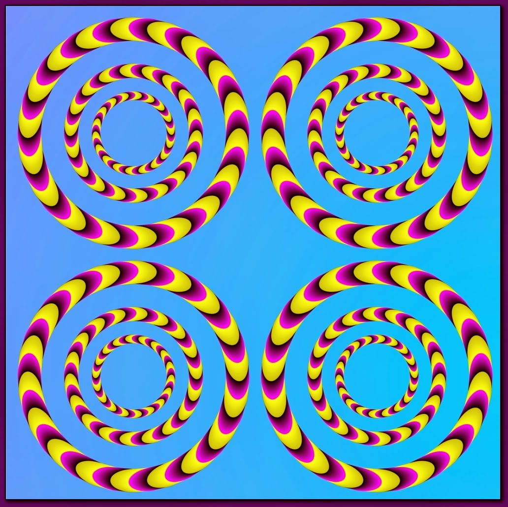
Field Journal #10: An Abstract Abyss Towards Optical Illusions
The day is finally here, the last field journal entry for the class. I was pretty hesitant about choosing a topic in this week's reading because I know it'll be my last entry (other than the final) and I've grown an attachment towards these entries every week. Enough of my rambling, here's today's field journal.
Of all the concepts mentioned in these two chapters, I had a connection with the rise of Japanese design section not because of half of my heritage, but how they incorporated influences from others to make new designs, yet keeping their roots. A design that caught my attention was Takenobu Igarashi's poster for the Kanagawa Art Festival, "a universe composed of dots evokes infinite time and space" (Meggs 490). I felt the ambiguity lying within this poster coming from the one shape it utilized, which was a simple circle. A circle, according to geometry, has an infinite amount of angles, and combining a bunch of circles, varying in different sizes, to form a warp-like space continuum.
 |
| https://www.pinterest.com/pin/178103360237094044/ |
After being "mesmerized" from the abyss-like space warp, it reminded me of optical illusions. Well, this one is easier on the eyes, not being as effective as others, but it could be one of the pioneering influences in optical illusions. We know the ones where we look at a certain pattern and they start to move or ones that look like one thing, but can also be interpreted as something else such as the glass/two people and the rabbit/duck.
 |
| http://www.ritsumei.ac.jp/~akitaoka/saishin-e.html |
 |
| http://www.thunderboy.org/Pics/Optical%20Illusions/Optical%20Illusion_030.html |
 |
| http://www.spring.org.uk/2012/01/duckrabbit-illusion-provides-a-simple-test-of-creativity.php |
The difference between these illusions and Igarashi's poster is the lacking of theme, but aside from that they are relatable in the sense of being "illusions." Other than entertainment or even pleasure, I'm not too sure what optical illusions can be utilized for. Maybe they might be used on some designs such as Igarashi's poster, or consist of an improvised version of an illusion, but I don't see optical illusions stepping out in the design industry as "masterpieces" or "the next Mona Lisa." A simple brain-teaser or interpretive image is a perfect category for them (in my opinion of course). However, I'm not too sure if the 3D chalk art seen on streets/roads count as illusions, but I'll just include one at the bottom just for fun. Enjoy!
 |
| http://pelfind.com/photo/85605p1822802/stunning-optical-illusions-created-by-street-chalk-artists |
Sunday, November 24, 2013
Field Journal #9: The Polish Poster
From this week's reading I was intrigued with the polish poster, more specifically the film poster for Rzeczpospolita Babska by Jerzy Flisak. Now doesn't that title just roll off the tongue. According to the book, it was "an almost casual collage approach, (...) created from torn and cut pieces of colored paper and then printed by the silkscreen process.
It's not common to see a publicized film poster made simply from torn colored paper, which could be due to it being a lot of work when less effort could be put to use by taking a picture of the actors/actresses in the film with a certain background. This can relate to my previous post about Saul Bass' "The Man with the Golden Arm" poster, however this was done with torn paper. It is very unique because it's not what is ordinarily seen on film posters, as well as the skilled "tearing" of paper to form such an image. It may seem simple at glance and others might think "Who made this!? It looks like a child's arts and crafts project," however this poster could be one of the many pioneering reasons that teachers incorporate projects with collages having torn colored paper and making an image, scene, or event from it.
I'm not too sure what other shows or well-known images contain torn pieces of colored construction paper, but using torn paper for a film poster to an animated show that is still currently airing is an accomplishment with such a simple technique. The problem is what I stated briefly, which is the creators don't make the show with torn paper anymore. With how technology is now, the use of torn colored papers could be rendered as obsolete due to time consumption. The amount of time it takes to make something out of torn paper in 15 hours could be reduced to 2-3 hours with a graphic design program. I believe that the type of style used with torn paper (character design, shapes, backgrounds) may still be used, but piecing torn pieces of paper together would remain only in the classroom for arts projects. I say this because it might not be appreciated as much as other art forms of posters, portraits, murals, that contain more details and are more realistic.
 |
| http://www.filmweb.pl/film/Rzeczpospolita+babska-1969-9303 |
It's not common to see a publicized film poster made simply from torn colored paper, which could be due to it being a lot of work when less effort could be put to use by taking a picture of the actors/actresses in the film with a certain background. This can relate to my previous post about Saul Bass' "The Man with the Golden Arm" poster, however this was done with torn paper. It is very unique because it's not what is ordinarily seen on film posters, as well as the skilled "tearing" of paper to form such an image. It may seem simple at glance and others might think "Who made this!? It looks like a child's arts and crafts project," however this poster could be one of the many pioneering reasons that teachers incorporate projects with collages having torn colored paper and making an image, scene, or event from it.
When I first saw this poster, I thought about a well-known show that involves children, vulgar language, explicit content, comedy, and parodies of politics, pop culture, social issues, conspiracies, etc. Do you know what I'm thinking about? It's the animated show known as South Park. Now I know it's not a poster or stilled image, but the roots are very similar. Before the creators moved onto production using the computer when technology had advanced greatly, they used to make their earlier shows using pieces of colored construction paper and shot the show frame shot by frame shot.
 |
| http://www.telegraph.co.uk/culture/tvandradio/6279830/South-Park-shows-Michael-Jackson-and-Patrick-Swayze-in-purgatory.html |
Tuesday, November 19, 2013
Field Journal #8: Film Title/Logos
As I was reading through the chapters, I stumbled upon the artwork of Saul Bass. The book describes his work as "reducing his designs to a single dominant image," yet what I get from it is more than just simplicity in a dominant figure (Meggs 395). Here are the examples for his logo and titles for a drug addiction film titled "The Man with the Golden Arm."
 |
| http://designhistorylab.com/sp2010dhl/wu/pages/bass.html |
 |
| http://brykhlee.wordpress.com/tag/saul-bass/ |
For a logo and film titles, these designs look more ambiguous and abstract than simple, even for a film. This caught my attention as soon as I saw these pictures, putting me in a deep trance, thinking about what the film would be about or consist of, excluding the cast and producers mentioned in the titles and logo. Now, if this was to be posted outside of a local movie theater without a commercial with its name, it might be a hit or miss with those passing by the poster. People either might be intrigued because of it's design or they could just walk away, not grabbing anyone's attention due to it lacking "flashiness" or a fan base. The book even mentions that motion pictures utilized "traditional portraits of actors and actresses in promoting films and mediocre and garish typography for film title" back then, which ironically, is used today in the poster designs of current and future films being shown at movie theaters. Whether it be the cost, the time, promotion effectiveness, this would be very interesting to see in the present day.
Now, I did mention briefly how the present designs for movie posters are no different than how they were back in the 1960's and before. Let's look at some movies that are out in theaters currently and/or will be showing.
 |
| http://collider.com/hunger-games-2-catching-fire-poster/ |
 |
| http://www.imdb.com/title/tt1981115/ |
 |
| http://www.impawards.com/2013/iron_man_three_ver11.html |
Yes, these are TOTALLY different from Bass' work, but they do follow along the lines of the post designs motion pictures consisted of back in the 1960's and before, add in a couple more actors/actresses with a matching setting/theme in the background and voila! In my honest opinion, Bass' design is original, but would be obsolete and not as marketable in today's society due to what's technologically available to the market. A successful advertising campaign will help bring in money for the producers, directors, everyone involved with the movie, and hopefully have the viewers leaving the theaters saying the movie was worth their money and that the poster design looks "cool." Ambiguity and simplicity does have its market, but I'm not too sure if it would do well in the present day entertainment industry where people want 3D and high definition graphics (with some exceptions of course), with the addition of profit-margin. In the end, I'm still interested in giving "The Man with the Golden Arm" a chance to watch just because of the film poster's ambiguity, as well as Frank Sinatra being in it.
Tuesday, November 12, 2013
Field Journal #7: Prototype for the modern map
From this week's reading, the one thing that stood out the most to me was the prototype for the modern map made by draftsman Henry C. Beck of the London Underground subway lines. What I found interesting about it is that it hasn't changed much in comparison to some of the maps that are readily available for public transportation in the present day.
With the BART map above, it is similar in it's color coded railways, legend/reference box, map name, city/street stops. It's not as geometrically angular like the London Underground and it's more detailed, showing parts of the ocean, green areas, surrounding highways and cities, etc. There is another map of the BART route that is more simplified without some of the details shown in the map above and is more angular in comparison to the BART map above. This demonstrates that the subway map for the London Underground's design has been the standard model for public transportation to this day. In some designs it can be seen as stagnant in comparison to everything else in graphic design, with the exception of maps in digital form, GPS, etc.
This is a portion of the light rail/bus routes in Downtown San Jose. What is notable aside from the color coded routes and the names of certain buildings/places are the bus numbers, grey spaces for buildings, and bathroom locations. Similar to the BART map, this however can get a little more confusing due to the fact of all the numbers, crossing colored routes, basically a lot of things going on the map. It might be because it is downtown which can seem cluttered, but nonetheless, has carried the same attributes as the London Underground map.
 |
| London Underground Map http://www.tfl.gov.uk/corporate/projectsandschemes/2443.aspx |
 |
| BART map http://zyxyvy.wordpress.com/2012/04/14/the-bart-map-to-scale/ |
With the BART map above, it is similar in it's color coded railways, legend/reference box, map name, city/street stops. It's not as geometrically angular like the London Underground and it's more detailed, showing parts of the ocean, green areas, surrounding highways and cities, etc. There is another map of the BART route that is more simplified without some of the details shown in the map above and is more angular in comparison to the BART map above. This demonstrates that the subway map for the London Underground's design has been the standard model for public transportation to this day. In some designs it can be seen as stagnant in comparison to everything else in graphic design, with the exception of maps in digital form, GPS, etc.
| Transit map http://sanjoseuu.org/AboutUs/publicTransit.html |
Now the question is how come the layout of public transportation maps haven't changed much, outside of the intricate details? My assumption is that it's already efficient as it is. Any more additional details would confuse viewers, making maps difficult to interpret. I guess it's along the lines of the saying "Why fix it if it isn't broken," which is true to a certain degree. A map is supposed to help/guide those in need of it, and these transportation maps fulfills that goal. Adding any other things would stray away from its purpose.
Tuesday, November 5, 2013
Field Journal #6: Plakatstil
Plakatstil, poster style, is a type of design that incorporates flat background colors, large, simple images, and product names. While this may seem simple enough, some rejected this type of design due to its lack of complexity, but within time and positive superior influence, it was accepted. Plakatstil, from my understanding, follows the phrase "less is more," meaning that there doesn't need to be a million things, objects, or shapes going on in a portrait in order to be considered good, even great. Now what successful companies have utilized this same technique in their logo/trademark?
 |
| http://entertainmentagentblog.com/2010/06/20/in-the-immortal-words-of-gary-gilmore-and-nike-just-do-it/ |
| http://50report.com/2013/05/16/sony-sets-1-4b-african-electronic-markets/ |
Although these were not painted and there are no pictures, Nike and Sony incorporate plakastil as their advertisement. These logos have been established for many years and very little to none has changed, aside from the shining light behind the Sony logo in commercials/videos and sound effects with matching animation bringing in the "swoosh" and "Just Do It." Now, these are the only companies that utilize this style as their logo, but the point I can see is that the more direct and simple the image is, the easier it would be to recognize it after minutes, hours, days, months, years, and even to memorize. No, I'm not saying that flashy and complex images aren't bad, but using plakatstil as a marketing tool/advertisement for companies is very efficient, well most of the time. Playing devil's advocate, there is a limit to how many companies use this technique if it only consisted of words, and plakatstil does use pictures as well in the present day.
 |
| http://onceuponasketch.com/2013/06/disney-animation-and-story-building-a-look-into-the-process/ |
 |
| http://www.hitfix.com/motion-captured/what-to-watch-for-now-that-disney-owns-lucasfilm |
The first image is Walt Disney Pictures plakatstil and the next image is the same logo, but obviously not plakatstil. This example demonstrates that sometimes evolving away from it's original outlook, plakatstil in this case, can be better not just for the company, but for the consumers and viewers due to the technology available.
In retrospect, plakatstil is still incorporated today in some ways, but can be looked at obsolete, even using the variant sachplakat, which is more concise and hyperrealistic. Some things can remain simplistic, whereas others are more direct through other methods and techniques.
Tuesday, October 29, 2013
Field Journal #5: Ukiyo-e and women
This week's reading was very informative in the development of art nouveau and the origins of the twentieth century design, however what struck me the most was the first two pages introducing ukiyo-e and the women painted in the style of art nouveau.
As I saw the word "ukiyo-e" and the examples of it given in the book, it made me think about my late grandfather's and uncle's house. Although their homes strayed away from the Japanese heritage, these ukiyo-e paintings were the only objects that represented their past history. It was either that, or they were just mere decoration. Philip Meggs states that "This epoch was the final phase of traditional Japanese history; it was a time of economic expansion, internal stability, and flourishing cultural arts," obliterating the fact that the ukiyo-e in their homes weren't just for decoration, but embracing their culture's history even though they've been established in America. This is the painting both homes had hung up, one was hung up in a room the left after entering the home and the other one was hung up in a family room.
Not only is there history behind the art style and colors used in paintings during specific years, but it can help reconnect those that share a similar history, such as myself and ukiyo-e paintings.
In addition to the ukiyo-e paintings, I was intrigued by Jules Cheret's "Palais de Glace, Champs-Elysee," not just for his usage of colors, which is really eye-catching and is still being used today, but more of the concept behind the painting. These women were "not only for the idealized presentation of women in mass media but for a generation of French women who used their dress and apparent lifestyle as inspiration," and "these self-assured, happy women enjoyed life to the fullest..." I'm not sure if this is valid to compare photographs of women today, seeing that everything today is photographed, but in comparison to present day, all the women that I see on advertisements are selling something other than themselves: cars, fitness programs, food, drinks, magazines. It's interesting that the women on images today depict towards something other than themselves, and these French women Cheret painted weren't even super famous or well-known, but lived a happy lifestyle. From being shown because of an inspired lifestyle to being shown not for the person, but for a product or service, is pretty shallow of companies and their advertising.
As I saw the word "ukiyo-e" and the examples of it given in the book, it made me think about my late grandfather's and uncle's house. Although their homes strayed away from the Japanese heritage, these ukiyo-e paintings were the only objects that represented their past history. It was either that, or they were just mere decoration. Philip Meggs states that "This epoch was the final phase of traditional Japanese history; it was a time of economic expansion, internal stability, and flourishing cultural arts," obliterating the fact that the ukiyo-e in their homes weren't just for decoration, but embracing their culture's history even though they've been established in America. This is the painting both homes had hung up, one was hung up in a room the left after entering the home and the other one was hung up in a family room.
 |
| http://kiritz.jp/2012/08/maruyama-okyo-great-art-of-drawing-and-simple-painting-style/ |
In addition to the ukiyo-e paintings, I was intrigued by Jules Cheret's "Palais de Glace, Champs-Elysee," not just for his usage of colors, which is really eye-catching and is still being used today, but more of the concept behind the painting. These women were "not only for the idealized presentation of women in mass media but for a generation of French women who used their dress and apparent lifestyle as inspiration," and "these self-assured, happy women enjoyed life to the fullest..." I'm not sure if this is valid to compare photographs of women today, seeing that everything today is photographed, but in comparison to present day, all the women that I see on advertisements are selling something other than themselves: cars, fitness programs, food, drinks, magazines. It's interesting that the women on images today depict towards something other than themselves, and these French women Cheret painted weren't even super famous or well-known, but lived a happy lifestyle. From being shown because of an inspired lifestyle to being shown not for the person, but for a product or service, is pretty shallow of companies and their advertising.
 |
| http://www.1stdibs.com/art/prints-works-on-paper/figurative-prints-works-on-paper/jules-cheret-palais-de-glace/id-a_15581/ |
Tuesday, October 22, 2013
The History Behind the Letters
Wow. That is how this week's reading left me after finishing the last page, and no it's not because I finished it all in one day, but because of the content. With Chapter 10 incorporating the arts and crafts movement's origins, I found Chapter 9 really intriguing. The Industrial Revolution played a key role with innovations making printing and typing more efficient, as well as photography first being developed. From hand printing and hand-type setters moving onto steam-powered printing presses and the Linotype/Monotype machines, the Industrial Revolution definitely revolutionized technology at the time.
The one thing that really peaked my interest was the innovations in typography. Utilizing the twenty-six letters of the alphabet and changing their appearances in height, width, thick and thin strokes. Also, the origins of where fonts received their names such as Robert Thorne's Egyptian style, a thinner style of Egyptian called Iconic, another altered version of Egyptian called Clarendon, and many more. In addition, decoration was added to letters such as thin shadings around the letters, making them three-dimensional, shadings in letters, designs, etc.
As soon as I finished this section of the chapter, I started to look around my room and my house for all the labels and the types of fonts and shadings that were used. From various chip bags, cereal boxes, medicines, magazines, video game covers, book covers, all having different logos consisting of different style fonts and sizes. Call me dumb, but I never took into account that the design of letters on logos and labels fell under the category of graphic design. Because of this I look at letters, whether on billboards, company logos, or on my favorite cereal, differently now. It's interesting what started as the regular alphabet expanded to it having unique designs, decorations, shadings, being thin or thick. I have a better understanding of where some of the name of certain fonts came from and that letters even have their own history.
 |
| http://www.diywebsitegraphics.com/Killer-Text-V1.html |
The incorporation of this type of design is still being used today. If all letters on advertisements, titles, labels, covers were all the same, there would be no unique appeal to the masses. I can only assume the reason why typefounders created different designs and layouts for letters was to stand out from everyone else. To market a service or product, and also following a certain theme. For example, the font design on the title of video game covers seem to correlate with the theme of a game: A game setting in the medieval era would have a font design related to that setting, a horror/survival game would have the font design in relation to it's genre, or a puzzle game having its title reflect the story of the game. Even though people say "don't judge a book by it's cover," some fonts on the covers of books are pretty enticing: shiny letters that bulge out a little further than the cover itself, uniquely designed like the children's book Goosebumps, and blocky-type ones as well. It seems that originality is a key factor from the origins of typography and companies are still recycling old ones, as well as making new ones.
*I'm showing these images that I mentioned for the font design, not for the images.
 |
| http://firsthour.net/series/resident-evil |
 |
| http://www.siliconera.com/2011/04/27/alternate-catherine-cover-art-for-north-america/ |
 |
| http://withfriendship.com/user/sathvi/vagrant-story.php |
 |
| http://www.overduereview.com/2013/06/10/top-five-bestworst-goosebumps-covers/ |
Tuesday, October 15, 2013
Field Journal #3: The evolution of books and illustrations
After diving in the assigned reading, I started to feel like I was in the movie Inception. I was reading a book and inside that book talked about printed books, showing pictures of books. On a serious note, I found these chapters just as interesting as the last assigned chapters, and no I'm not saying that just to kiss butt, but I'm always reading from a book, electronic or physical, and always thought where the idea of books came from.
In addition to foldouts in magazines, there are children books that consist of pop ups and motion tabs that bring the books to life. It may not be a fold out, but maybe it could have derived from it or had been an improvisation of it. Catering to children requires a lot of interaction, especially for learning, and the pop ups and motion tabs help that out a lot.
In short, these chapters consisted of printing in Europe, different techniques of printing, and what printing was used for. As the printing of books became more available and affordable, the demand for them started to skyrocket, as well as the quality and quantity in these books. With woodblock printing to detailed illustrations, colors, layouts, and other ideas gave life to books.
What caught my attention was the first foldout illustrations of Methoni, Greece and the Greek island of Rhodes by Erhard Reuwich. The foldouts were four-page-views of these beautiful places, but what struck me was the fact that this is were foldouts in magazines and other books originated from that are still being used today. However, the foldouts today often seen in magazines isn't utilized the same way as Reuwich used his for. While Reuwich used his panoramic views of beautiful cities for his journal sightings, companies use people (male and/or female) with voluptuous bodies to market a product or they're used just to showcase things such as cars, houses, or a bunch of ideas bundled up into an abstract illustration.
 |
| cityofsound habitus magazine |
 |
| magazineadsandbooks.com |
In addition to foldouts in magazines, there are children books that consist of pop ups and motion tabs that bring the books to life. It may not be a fold out, but maybe it could have derived from it or had been an improvisation of it. Catering to children requires a lot of interaction, especially for learning, and the pop ups and motion tabs help that out a lot.
 |
| Ellen K; article written by Nicole Chenoweth; ryanseacrest.com |
Monday, October 7, 2013
From Ancient Ages to the Digital Age
 |
| http://pics7.this-pic.com/key/ancient%20egyptian%20pictographs |
In addition to the images, words also contribute to ideas. Without much of a structure, Egyptian scribes were able to come up with a system called the rebus system when they stumbled across difficult words to draw out, using pictures instead for guidance in pronunciation. However, as years passed, learning words, even another language, became easier resulting in what is offered today. Schools are teaching other languages in addition to the native language of the country, as well as programs such as Rosetta stone that helps others with not only reading, but pronouncing words in a different language. So the next time we come across websites that help translate another language or an online dictionary or anything in relation to pictures and words, we owe it all to those in the ancient times with their creativity and innovation in wanting to create a system, or even to just simply tell a story or their day.
 |
| Megg's History of Graphic and Design ex 1-25 |
Monday, September 30, 2013
Field Journal #1
For our first field journal we were instructed to look at all the pictures in our textbook Megg's History of Graphic Design. After looking at all of the pictures in the book chronologically, it was evident that graphic design has evolved in a timely manner throughout its timeline. I stumbled across some familiar pictures, as well as ones I've never seen before.
Prior to examining all the pictures within the book, I read the first week's lecture introduction module and wanted to correlate the last statement in it with my observations, graphic design is about communication and meaning (Manske).
As I skimmed through the book I noticed two obvious things, words and pictures. They could be interpreted as being what they appear, but what keeps coming to mind is "a picture is worth a thousand words," and there is more to the picture then what is shown. Relating to the statement in the module, I always thought about what was the artist/creator of the picture/propaganda/writing and their intentions were. Portraying a male or female, the colors used, the words and their structure (in the sense of placement on the picture and if it's straight or designed a certain way), the fonts of the words, language, the list goes on. Whether if it's just advertising or a story, there's meaning behind it and it's trying to communicate (figuratively) to those who come across it.
Something else that came into mind (and correct me if I'm wrong please) was a similar language that was shared throughout the years, which is the language of images/pictures. This correlates to hieroglyphics, but also symbol signs we see on the road, whether it's a freeway, highway, or city street. If we were put into a new country that we don't know the language to, the picture symbols around the city would be very helpful instead of trying to learn the language in minutes.
Subscribe to:
Posts (Atom)